Joyfit
Cycle and fitness so good your body will beg for mercy.
A Community of Fitness Lovers
Joyfit is a modern cycling and fitness studio founded on the principle that fitness should be fun, manageable, and effective.
Joyfit came to us looking for a fresh take on their identity that would make it more scalable across platforms and approachable to a wider variety of people. We worked with Joyfit to create a new identity and stronger brand voice for them and to develop a suite of stationary, print collateral, illustrations, and iconography.


Illustration system
To incorporate excitement and pops of color into the Joyfit brand, we developed an illustration system for their studio. These illustrations were painted as murals in the physical studio space and can also be scaled and replicated for various marketing needs.
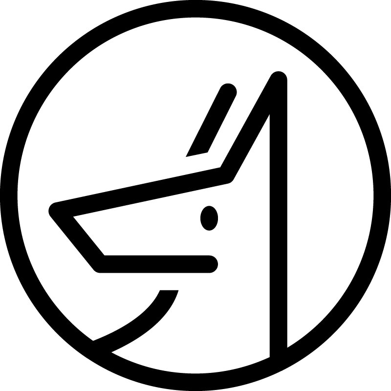
A New Identity
We tackled the challenge of Joyfit’s identity head on with the intention of maintaining a sense of friendliness with an underpinning of strength and discipline.
Softer touches in the lowercase j and y of their logotype maintained that easy approachability, while the “infinity cycle” mark instilled the idea of continuously working toward physical fitness


